Microsoft Surface Pro 4 Review 2017
The Microsot Surface family first came to light in 2012. At the time when tablet fuorius was quite common, Microsoft managed to talk about its name with tablet computers running Windows, unlike its competitors. Today, five new Surface devices, one of which is the notebook, are introduced.

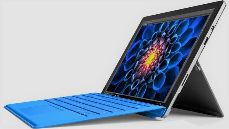
Microsoft Surface Pro 4 is larger than the size of the tablet we are used to. It can be classified as a model between tablet and notebook with 12.3 inch screen size. When we look at Surface Pro 4, we first look out for the Skylake class processor, internal stand, pen, refurbished keyboard and mouse. We do not see a radical change to Surface Pro 3, but we see that almost every existing hardware has been developed.
Microsoft Surface Pro 4’s biggest competitors in the design sense are Macbook Air and iPad Pro. Against these challenging rivalries, we tried to stand out with ergonomics, not with the beauty of design. The devices that we already use in Surface Pro are exactly the devices that are produced for this purpose.
The Surface Pro 4 is both slimmer and lighter, despite having a larger 0.3 inch screen than the Surface Pro 3. Moreover, the dimensions of both devices are the same.
When we look at the front of the device we see that it is completely covered with glass. The Windows button on the front of the previous model has been removed. Thanks to the space that has been removed, the screen has reached a 12.3-inch screen that can be enlarged at least. This brings us to the thin frames. According to the previous model, the thinning of the frames has strengthened the design.

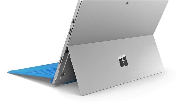
When we look at the back of the device, we see that magnesium-coated material is used here. We see a stand leg in this section to put the tablet on the table with a beveled angle. The opening angle of this stand is very high. It is designed not only to face the audience but also to use the tablet by looking at it from the top. On the back of this booth is a stylish Windows logo. On the back is nothing more than a camera, a microphone and a noise canceller.
When we look at the left side of the Tablet we see the active cooling holes. These cooling holes are not found in Core m3 processor models. We’ve got a magnet on the left so we can stick the pencil. In the previous model we wore the pen next to the keyboard. We can now attach it to the screen. On the left side is a 3.5 mm headphone jack.
Microsoft Surface Pro; 4 8.45mm thick and 766 grams for the Core m3 model and 786 grams for the other models. It’s exciting to be so thin and light when we think that a desktop-class processor is in it. It is so thin and light that you can not believe that you have a Core i5 or Core i7 in it.
When we look at the display hardware, we see a 12.3-inch PixelSense display. The resolution of the display is 2736 x 1824. We can see that the resolution is increased compared to the previous model. The screen is 267 pixels inches on the screen.

It’s a 3: 2 ratio, not 16: 9. This means you have a wider screen for vertical use. It’s an important detail. The color accuracy on the screen, the sharpness of the images, the contrast ratio and the wide viewing angles are at the top level. The quality on the screen is better than the Macbook Air, but with the iPad Pro, it’s head-to-head.
With the Hello feature that comes with Windows 10, it is possible to open your Windows 10 sessions with your front camera. You can also use a fingerprint reader. Microsoft went to various improvements in the front camera to use the feature. Front camera with 5 MP resolution and 1080p video recording capabilities. As in the previous model, this camera also features face tracking.
